

Why Analytics Alone Cannot Explain User Frustration
Product analytics can show where users drop off, but it often cannot explain why they felt confused, stuck, or frustrated in the first place.
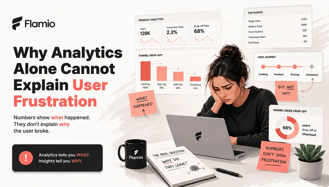
Product analytics can show where users drop off, but it often cannot explain why they felt confused, stuck, or frustrated in the first place. Product analytics has become one of the most important parts of modern product development. Teams use dashboards to track activation, retention, conversion, churn, feature adoption, funnel performance, and dozens of other metrics that help them understand how a product is performing. This is a good thing. Without analytics, product teams would be guessing. They would not know where users abandon a flow, which features are used most often, which experiments improve conversion, or which parts of the product create measurable business impact. But there is a limitation that many teams eventually face. Analytics can tell you what happened. It does not always tell you why it happened.
Analytics does not always explain the reality behind the numbers
A dashboard may show that users drop off at the second step of onboarding. A funnel may reveal that only 38% of users complete a signup process. A product analytics tool may show that a feature has low adoption. But the data alone rarely explains the emotional and behavioral reality behind those numbers. Did users fail because the interface was confusing? Because the copy was unclear? Because they did not trust the product? Because the next step felt too demanding? Because the layout created hesitation? Because the value was not obvious enough? Those are not just analytics questions. They are UX behavior questions. And this is where product analytics alone often reaches its limit.
Metrics are useful, but they flatten user experience
Metrics are powerful because they simplify reality. They take complex user behavior and turn it into something measurable. A product team can look at a conversion rate, compare it with last week, and make decisions based on a clear signal. The problem is that simplification also removes context. A drop-off rate does not show uncertainty. A conversion chart does not show hesitation. An event path does not show confusion. A retention graph does not show frustration. When a user struggles inside a product, the experience is often messy and human. They may reread a sentence several times. They may hover around a button before clicking. They may scroll up and down looking for something. They may click a non-clickable element because it looks interactive. They may abandon the flow not because they do not want the product, but because the interface created too much doubt. In analytics, all of this may appear as a single number: drop-off. That number matters. But it is not the full story. This is why product teams can have excellent analytics dashboards and still misunderstand their users. The data can be accurate while the interpretation remains incomplete.
User frustration is behavioral before it becomes measurable
User frustration does not always announce itself clearly. Most users do not send feedback when they get stuck. They do not open a support ticket for every confusing button. They do not write a detailed explanation every time a flow feels unclear. They simply slow down, try something else, or leave. This is why user frustration is often visible first through behavior. A user clicks repeatedly on the same element. A user moves back and forth between two screens. A user scrolls without taking action. A user pauses for a long time before continuing. A user opens a dropdown, closes it, and then abandons the task. A user misses the expected CTA and finds a longer path instead. These behaviors can indicate friction, but they need interpretation. Not every pause is a problem. Not every repeated click is frustration. Not every alternative path is a failure. Context matters. A user pausing on a pricing page may be comparing plans. A user pausing during onboarding may be confused about what information is required. A user clicking a card may be exploring, or they may expect the card to behave like a button. This is why behavioral analytics is more useful when it is connected to product context, user intent, and the expected flow. Without that context, teams may see the signal but misunderstand the cause.
Product analytics shows symptoms, not always causes
A common mistake in product teams is treating metrics as explanations. For example, a funnel may show that users abandon the checkout flow at the payment step. It is tempting to assume that the payment step itself is the problem. But there may be many possible reasons behind the same metric. The shipping cost may appear too late. The form may ask for too much information. The payment button may not look trustworthy. The error message may be unclear. The user may not understand whether they will be charged immediately. The page may work poorly on mobile. The previous step may have failed to build enough confidence. The metric points to the location of the problem, but not necessarily to the reason. This is true across many product areas. Low activation does not automatically mean onboarding is too long. Low feature adoption does not automatically mean the feature is unnecessary. High drop-off does not automatically mean users are not interested. Low conversion does not automatically mean the offer is weak. Sometimes the product value is there, but the experience fails to communicate it clearly enough. That distinction is important because different causes require different solutions. A team that misreads the cause may redesign the wrong part of the product, rewrite the wrong copy, or remove a feature users actually wanted but could not understand.
The danger of over-optimizing dashboards
Product analytics can make teams feel confident because numbers look objective. But numbers can create a false sense of certainty when they are separated from user behavior. A team may see that a button gets fewer clicks than expected and decide to make it bigger. They may see low completion on a form and remove fields. They may see users skipping a step and decide the step is unnecessary. Sometimes these decisions are correct. Sometimes they are not. The risk is that teams start optimizing visible metrics without understanding invisible friction. For example, increasing clicks is not always the same as improving UX. A button may get more clicks because it became more visible, but users may still be confused after clicking it. A shorter onboarding flow may improve completion but reduce user understanding later. A more aggressive CTA may increase trial starts but lower long-term retention. Metrics are not wrong. They are just incomplete. Good product decisions require combining quantitative signals with qualitative and behavioral evidence. Product analytics can show where to look. UX behavior helps explain what is happening there.
Why surveys and interviews are not enough either
When analytics cannot explain user frustration, teams often turn to surveys or interviews. These methods are valuable, but they also have limitations. Users are not always good at explaining what confused them. They may forget the exact moment where they hesitated. They may describe the problem in vague language. They may give socially acceptable answers. They may say the product was "fine" even when their behavior showed friction. This does not mean user interviews are useless. They are essential for understanding motivation, expectations, context, and mental models. But when it comes to frustration inside an interface, behavior often reveals things users do not verbalize. A user may not say, "The visual hierarchy made me miss the primary action." They may simply fail to click it. A user may not say, "The form created trust anxiety." They may simply stop before submitting. A user may not say, "The information architecture does not match my expectations." They may simply search in the wrong place. This is why UX insights become stronger when teams combine what users say with what users do.
Behavioral analytics connects the missing layer
The missing layer between product analytics and UX research is behavioral analytics. Product analytics answers: what happened at scale? UX research answers: what do users need, expect, and struggle with? Behavioral analytics helps connect both by looking at how users actually move through the interface. This includes signals like hesitation, repeated clicks, rage clicks, dead clicks, scrolling behavior, path deviation, task completion, and interaction patterns across sessions. But the real value is not just detecting those signals. The value is interpreting them inside the product flow. A dead click on a decorative image may not matter. A dead click on a card that looks like it should open a feature may matter a lot. A pause during reading may be normal. A pause before a required action may suggest uncertainty. A user taking a longer path may be acceptable if they still complete the goal, or it may reveal that the primary path is not obvious enough. Behavioral analytics becomes useful when it helps teams move from "something happened" to "this may be why it happened." That is the difference between data and insight.
User frustration often hides inside successful flows
One of the biggest reasons analytics alone misses frustration is that not all frustrated users fail. Some users complete the task, but only after unnecessary effort. They eventually sign up, but they hesitate through the process. They eventually find the feature, but only after clicking around. They eventually complete onboarding, but they feel uncertain about what happened. In analytics, these users may appear as successful conversions. But from a UX perspective, the experience still has problems. This matters because friction does not always destroy conversion immediately. Sometimes it weakens trust, reduces confidence, and lowers the chance that users will return. A user may complete a flow once but decide not to come back because the experience felt harder than expected. Traditional product analytics may not show that clearly. The flow succeeded, so the dashboard looks fine. Behavioral analysis can reveal the hidden cost of that success. This is especially important for product teams working on onboarding, activation, SaaS dashboards, checkout flows, pricing pages, and complex product interfaces. In these areas, the difference between "completed" and "completed confidently" can affect long-term retention.
Better UX insights come from combining signals
The solution is not to abandon product analytics. Product analytics is essential. Teams still need funnels, cohorts, events, retention reports, and conversion tracking. The solution is to stop expecting analytics to explain everything by itself. A stronger product workflow combines multiple layers: product analytics shows where the issue may be happening, session behavior shows how users experience that moment, usability research explains what the friction means, and product judgment decides what to change. This combination helps teams avoid shallow conclusions. Instead of saying, "Users drop off at step two, so let us remove step two," the team can ask, "What happens inside step two? Do users hesitate? Do they misunderstand the copy? Do they click the wrong element? Do they fail because the step is unnecessary, or because it is poorly explained?" That second approach is slower than blindly reacting to a metric, but faster than redesigning based on the wrong assumption. And in product development, avoiding the wrong fix is often just as valuable as finding the right one.
Where AI can help interpret user behavior
AI has the potential to make behavioral analysis more practical for product teams, but only if it is used correctly. The value of AI in UX is not generating generic advice like "make the button more visible" or "improve the user experience." That kind of output is too shallow to help serious product teams. The real value is helping teams process behavioral evidence faster. AI can help detect repeated friction patterns across sessions. It can compare actual user behavior with an expected happy path. It can identify moments where users hesitate, click incorrectly, miss important actions, or deviate from the intended flow. It can summarize these patterns into UX insights that a designer, product manager, or researcher can review. This does not replace human judgment. It gives humans a better starting point. Instead of watching every session manually, a team can focus on the moments that seem most relevant. Instead of guessing why a metric changed, the team can review behavior around the exact part of the flow where the issue appears. This is the direction modern UX analytics is moving toward: not just more data, but more useful interpretation.
From product analytics to actionable UX insight
At Flamio, we think the next step for product teams is connecting product analytics with behavior-based UX insight. Numbers are important, but they are not enough. Teams need to understand what users actually do inside a flow, where they hesitate, where they deviate, and which patterns repeat across multiple sessions. Flamio is being built to help teams turn user behavior into actionable UX insights. A team can define an expected happy path, collect short user tests, and use AI to identify friction patterns that would otherwise require manual review. This is not about replacing analytics platforms. It is about adding the layer that analytics often misses. Product analytics can show that users dropped off. Behavioral UX insight can help explain why. That difference matters because modern product teams do not just need dashboards. They need clarity.
Analytics tells you where to investigate. Behavior tells you what to understand.
Product analytics is one of the most powerful tools available to modern product teams. It helps teams measure performance, track user journeys, and make better decisions at scale. But analytics alone cannot fully explain user frustration. Frustration lives in the details: hesitation, confusion, missed expectations, unnecessary effort, and moments where the product does not behave the way users expect. These moments often appear only when teams look beyond the metric and study behavior in context. The future of UX insights will not be analytics versus research. It will be analytics plus behavior. Quantitative signals plus qualitative context. Dashboards plus real user interaction. AI-assisted pattern detection plus human product judgment. Because knowing what happened is useful. But understanding why it happened is what helps teams build better products.
Takeaway
Product analytics can show where to investigate. Behavior-based UX insight helps teams understand what actually happened and why users felt frustrated.
More Flamio notes
The End of Watching Session Replays by Hand
Session replay gave teams visibility, but the next product advantage is finding the moments that deserve attention without watching hours of playback.
AI insightsThe Best AI UX Research Will Start With Behaviour, Not Prompts
AI UX research becomes more useful when it starts from real user behavior, intended journeys, and friction patterns rather than isolated interface prompts.
Founder notesBefore You Hire a UX Researcher, Test One Flow
Early teams can learn a surprising amount by testing one critical flow before building a large research process or hiring a dedicated researcher.